We are often faced with the question of how conversations differ
between groups. One way of answering this question is to look at the
weighted log odds ratio (WLOs) for terms used in each group.
This value measures the strength of association between a word and a
target category in a corpus (or dataset). ParseR uses functions from the
tidylo package to calculate these. This very nice
blog by Sharon Howard outlines the utility of WLOs compared to other
methodologies to indentify word importance, such as tf-idf and this
blog post by Tyler Schnoebelen is also recommended reading.
To demonstrate how to use the calculate_wlos function,
we will use the example data included within the ParseR package.
# Example data
example <- ParseR::sprinklr_export
Calculate Weighted Log-Odds Ratios
Let’s say we want to compare how males and females talk about Hispanic Heritage Month.
example <- example %>%
  ParseR::clean_text(text_var = Message) %>%
  dplyr::mutate(Message = tm::removeWords(x = Message, c(
    tm::stopwords(kind = "SMART"),
    "ll", "de", "don", "ve", "didn", "doesn",
    "isn", "bit", "ly", "pic", "htt"
  )))
# Remove rows with no gender information
example <- example %>%
  dplyr::filter(SenderGender != "NA")

# Calculate WLOs
wlos <- ParseR::calculate_wlos(example,
  topic_var = SenderGender,
  text_var = Message,
  top_n = 30
)
example is a list object that contains two items:
- view: a human-readable tibble that contains the weighted log-odds for each of the top_n = 30 terms
wlos$view## # A tibble: 60 × 4
## SenderGender word n log_odds_weighted
## <chr> <chr> <int> <dbl>
## 1 M celebration 43 1.70
## 2 F learning 26 1.49
## 3 F today 24 0.951
## 4 F honor 20 1.08
## 5 F proud 20 0.957
## 6 F work 17 0.904
## 7 F power 13 1.40
## 8 M festival 13 1.66
## 9 F put 12 1.35
## 10 F generations 11 1.30
## # ℹ 50 more rows- viz: a plot that visualises terms in the view tibble with term frequency on the x-axis, and weighted log-odds on the y-axis.
wlos$viz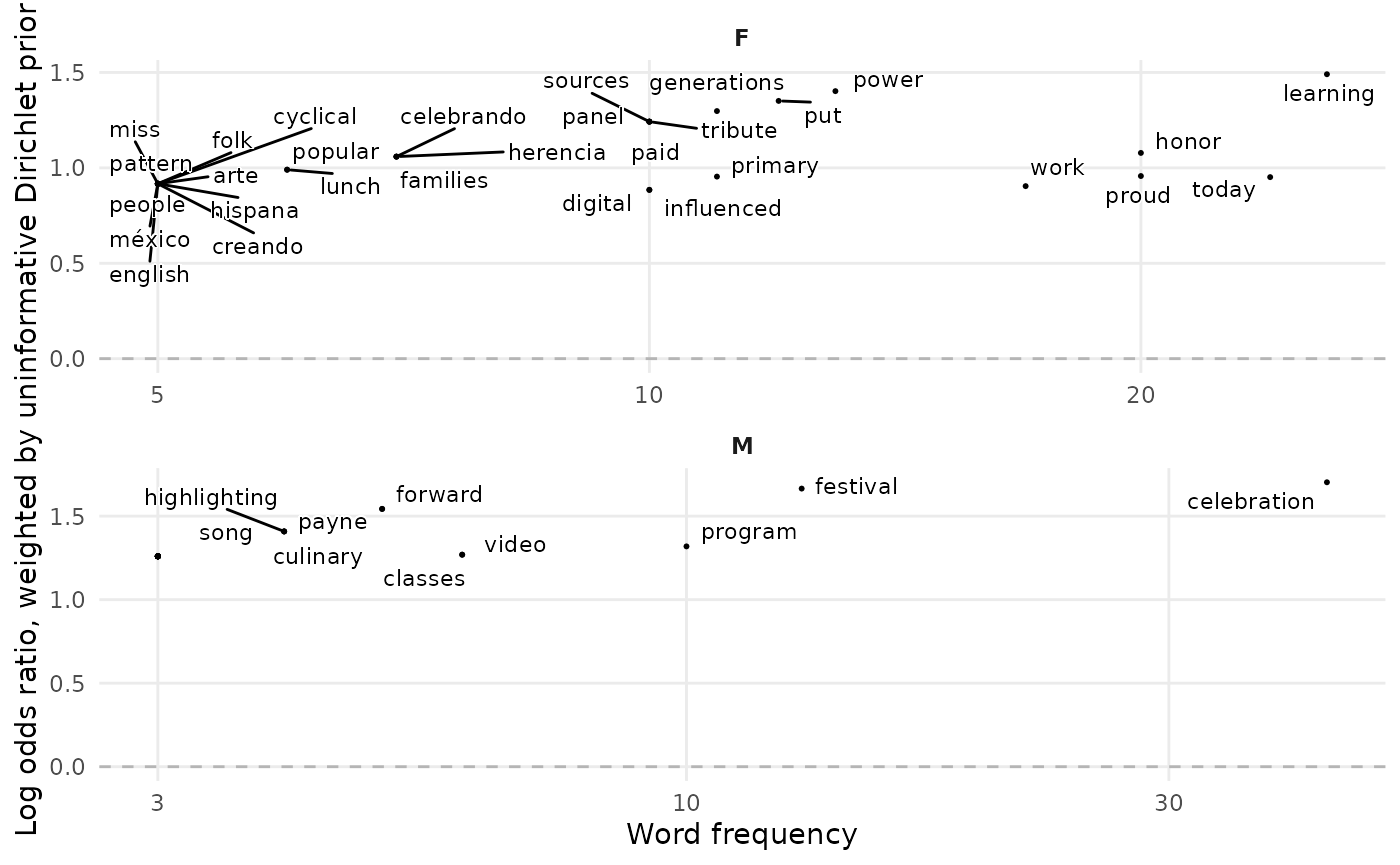
What we can learn from the plot is that men appear more likely to associate Hispanic Heritage Month with the celebratory aspects, whereas women discuss the learnings they can take from it.
Advice on Interpreting Weighted Log-Odds Ratios
As mentioned at the beginning of this document, WLO is a statistical measure used to determine which words are most strongly associated with a particular category. This is calculated by comparing the frequency of each word in the target category to its frequency in all other categories within the corpus (or dataset).
The value can be interpreted as the logarithm of the ratio of the probability of observing a word in the target category to the probability of observing the same word in all other categories combined. A WLO value > 0 indicates the word or phrase is more strongly associated with the target category than with other categories, whilst a value <0 indicates the others.
In other words, it’s important to remember that the magnitude of a WLO value reflects the strength of the association, but it is not directly interpretable as a probability or frequency. Rather, it reflects the logarithmic difference between two probabilities (or odds), and should be treated as a relative measure of association.
Therefore, when reporting WLO to clients, one must refrain from using phrases such as “This term is X times as likely to appear in Category A than Category B and C”, and instead use phrases such as “This term has a stronger association with Category A than Category B and C”.
Group Term Coverage (GTC)
Separately to understanding how groups differ, we may want to validate that the description, or label, of a group is appropriate. For example, if we have named, or an automated process has named, a group within our dataset ‘Instagram Account Recovery’, but we find that ‘Instagram’ only occurs in 10% of the documents in our topic, then we need to check what is inside the other 90%. Was the naming or labelling correct, and people are in fact talking about ‘Instagram Account Recovery’, or was the naming too specific, or outright incorrect?
We introduce GTC as an experimental, defensive tool; used for guarding against over-zealous generalisations. The idea is that gtc will be used alongside other methods for naming and inspecting groups of data.
Removing stopwords is vital, otherwise the vast majority of our top terms by % in each group will likely be stopwords, and the output will be less informative than it otherwise would have been.
How Does it Work?
Algorithm
For calculate_gtc, the algorithm works as follows:
For each group in our dataset, and for each document in our groups, we extract the terms that are present in the document; where terms can be a word, or n-gram i.e. n = 2 is a bigram, n = 3 is a trigram.
We treat terms as clearly demarcated words, i.e. ‘blessing’ would not add a count for ‘less’ despite ‘less’ being contained in ‘blessing’. This is also means that terms contained in hashtags are not counted for the term.
We then calculate the % of the group’s document each term appears in. This tells us the term’s coverage within the group.
For calculate_cumulative_gtc there are some additional
steps, which add a non-negligible degree of complexity.
Once we have extracted the terms for each group, and calculated their %s within the group, we rank the terms for each group in descending order of their %s, so the term in the highest % of the group’s documents will be rank 1, the therm in the second highest % will be rank 2 and so on and so forth.
We then calculate, for the top_n terms, the union of
documents any of the terms occurs in, i.e. the cumulative % of terms for
ranks 1:top_n. We receive:
- % of documents the term in rank 1 occurs in
- % of documents the terms in rank 1 or rank 2 occur in
- % of documents the terms in rank 1 or rank 2 or rank 3 occur in…
How Do I Interpret the Values?
The functions output is a type of ‘what you see is what you get’ - there are not hidden calculations, data transformations, weightings or smoothing values. So the difficult task is in integrating the information you receive here into a wider analysis.
Many natural questions, such as ‘What is the minimum value I should accept for the top_n terms in a group?’ justifiably have no universal answer. This will be entirely dependent on the type of grouping, and the task at hand. A rule of thumb would be to say that if the naming of your group is very specific to a particular keyword, then you should expect a high value for that keyword, or its synonyms. If the naming of your group is very general, then you may tolerate - and indeed expect - a lower value.
GTC is not intended to be a silver bullet, just another tool we can bring to bear the never-ending quest to better observe and understand our data.
Practial Usage
The initial update ships with four user-facing 1 functions, two for calculation and two for visualisation.
calculate_gtc: for each group in the dataset, and for each of the top_n terms within each group, calculate the % of documents the term occurs in.viz_gtc: render a bar char of the top terms per group arranged by the % of the group’s documents the term appears in, coloured by the overall frequency within the dataset.calculate_cumulative_gtcfor each group in the dataset, calculate the cumulative percentage of documents the top 1:top_nterms feature in.viz_cumulative_gtcThe
viz_*functions are unlikely to remain stable as they are sketches for what a visual analysis of GTC could look like.
Example Workflow
Let’s take a look at the code and the output of the gtc
functions on our example dataset. 2
GTC
First we decide our group variable, and then we
calculate_gtc to get a data frame of the top terms per
group.
(
gtc <- example %>%
  calculate_gtc(group_var = SenderGender,
                text_var = Message,
                ngram_n = 1,
                top_n = 20)
)
## # A tibble: 41 × 5
## SenderGender term doc_count percentage global_count
## <chr> <chr> <int> <dbl> <int>
## 1 F hispanic 217 67.2 415
## 2 F heritage 189 58.5 342
## 3 F month 90 27.9 157
## 4 F students 39 12.1 75
## 5 F celebrating 35 10.8 67
## 6 F celebration 33 10.2 76
## 7 F learning 26 8.05 29
## 8 F night 25 7.74 36
## 9 F community 24 7.43 38
## 10 F today 24 7.43 31
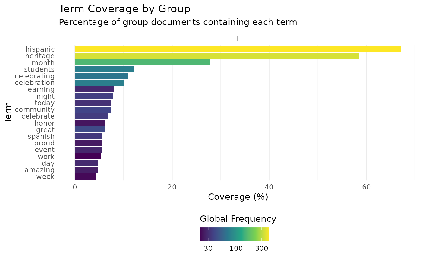
## # ℹ 31 more rowsThe tibble shows us that ‘hispanic’ is in 67.2% of the documents for the SenderGender == “F”, and 68.8% for “M”. We can split the data frame upt o view the highest per each group like so:
## <list_of<
##   tbl_df<
##     SenderGender: character
##     term        : character
##     doc_count   : integer
##     percentage  : double
##     global_count: integer
##   >
## >[2]>
## $F
## # A tibble: 20 × 5
##    SenderGender term        doc_count percentage global_count
##    <chr>        <chr>           <int>      <dbl>        <int>
##  1 F            hispanic          217      67.2           415
##  2 F            heritage          189      58.5           342
##  3 F            month              90      27.9           157
##  4 F            students           39      12.1            75
##  5 F            celebrating        35      10.8            67
##  6 F            celebration        33      10.2            76
##  7 F            learning           26       8.05           29
##  8 F            night              25       7.74           36
##  9 F            community          24       7.43           38
## 10 F            today              24       7.43           31
## 11 F            celebrate          22       6.81           35
## 12 F            great              20       6.19           41
## 13 F            honor              20       6.19           24
## 14 F            event              18       5.57           28
## 15 F            proud              18       5.57           25
## 16 F            spanish            18       5.57           34
## 17 F            work               17       5.26           21
## 18 F            amazing            15       4.64           26
## 19 F            day                15       4.64           29
## 20 F            week               14       4.33           22
##
## $M
## # A tibble: 21 × 5
##    SenderGender term        doc_count percentage global_count
##    <chr>        <chr>           <int>      <dbl>        <int>
##  1 M            hispanic          154      68.8           415
##  2 M            heritage          144      64.3           342
##  3 M            month              61      27.2           157
##  4 M            celebration        43      19.2            76
##  5 M            students           32      14.3            75
##  6 M            celebrating        31      13.8            67
##  7 M            great              17       7.59           41
##  8 M            community          13       5.80           38
##  9 M            culture            13       5.80           23
## 10 M            festival           13       5.80           17
## # ℹ 11 more rows
Alternatively, we can visualise the top terms by group in a facetted bar chart, where we set the number of rows according to the number of groups.
gtc %>%
  viz_gtc(SenderGender, nrow = 1)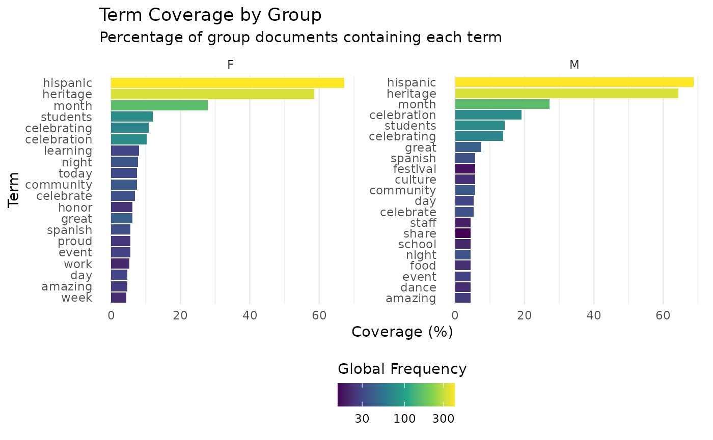
If I just wanted to view the chart for a single value (or a restricted number of all groups) of my grouping variable, I could filter the data frame prior to plotting:
Cumulative GTC
As we are probably going to use a number of terms to name our groups,
we should be interested in understanding what % of our documents are
covered by collections of terms. For this purpose we introduce the
calculate_cumulative_gtc function, which will tell us how
many of a group’s documents are covered by the 1:top_n
terms
(
cumulative_gtc <- example %>%
  calculate_cumulative_gtc(SenderGender, Message) %>%
  filter(SenderGender == "F")
)
## # A tibble: 10 × 6
## SenderGender term term_rank cumulative_percentage doc_percentage
## <chr> <chr> <int> <dbl> <dbl>
## 1 F hispanic 1 67.2 67.2
## 2 F heritage 2 67.8 58.5
## 3 F month 3 68.1 27.9
## 4 F students 4 70.0 12.1
## 5 F celebrating 5 71.2 10.8
## 6 F celebration 6 73.1 10.2
## 7 F learning 7 74.3 8.05
## 8 F night 8 74.6 7.74
## 9 F community 9 76.2 7.43
## 10 F today 10 78.6 7.43
## # ℹ 1 more variable: doc_frequency <int>For ease of analysis, we’ll focus solely on SenderGender == “F”. We can see that the terms ‘hispanic’ and ‘heritage’ occur in 67.2% and 58.5% of the data respectively. We also see that their cumulative % of documents covered is 67.8, which means adding ‘heritage’ has only added 0.6%, indicating ‘heritage’ nearly exclusively co-occurs with ‘hispanic’.
cumulative_gtc%>%
  viz_cumulative_gtc(SenderGender) +
  ggplot2::facet_wrap(~SenderGender)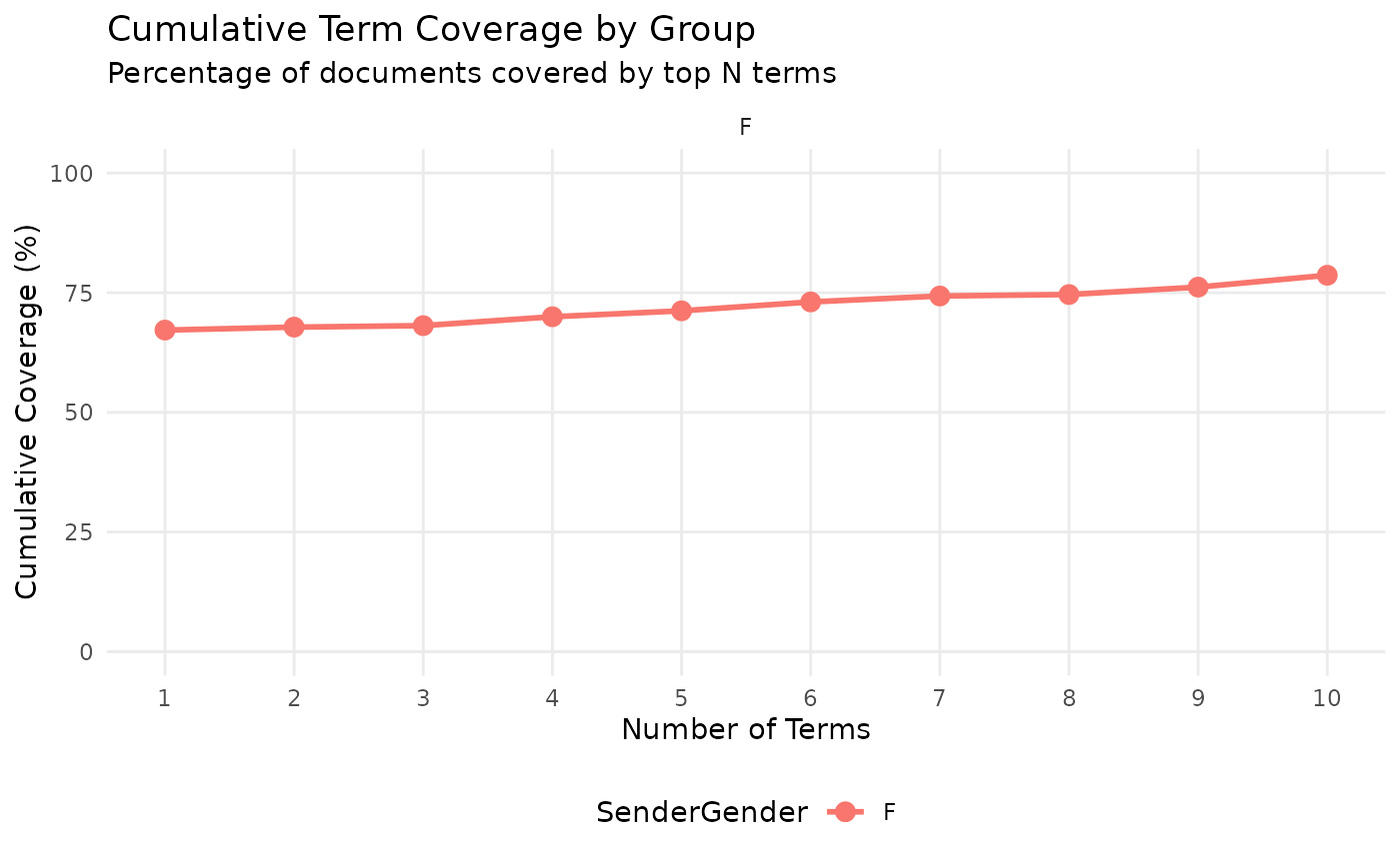
Stopwords
We stated above that removing stopwords is an important step, but following the Royal Society’s motto of ‘Nullius in verba’ - take nobody’s word for it - let’s see for ourselves.
Immediately we see the effect of data cleaning on our dataset. First,
the % of documents ‘hispanic’ features in has dropped slightly, despite
its overall number of documents increasing. This is due to posts that
are removed by the clean_text function.
Second, we see that a URL now takes third place, followed by stopwords and hashtags until ‘month’.
example_with_stops <- ParseR::sprinklr_export %>%
  dplyr::filter(SenderGender != "NA") %>%
  dplyr::mutate(Message = tolower(Message))

(gtc_with_stops <- calculate_gtc(example_with_stops, SenderGender, Message, 1, 20)
)
## # A tibble: 40 × 5
## SenderGender term doc_count percentage global_count
## <chr> <chr> <int> <dbl> <int>
## 1 F hispanic 220 66.1 425
## 2 F com 207 62.2 354
## 3 F heritage 193 58.0 348
## 4 F pic 179 53.8 298
## 5 F twitter 179 53.8 298
## 6 F the 150 45.0 347
## 7 F of 124 37.2 251
## 8 F and 118 35.4 265
## 9 F to 111 33.3 251
## 10 F hispanicheritagemonth 107 32.1 164
## # ℹ 30 more rowsIn our cumulative data frame with a heavily-cleaned text variable, our cumulative percentage at the third term - month - was 68.1%, in our cumulative data frame which has only been lower-cased, i.e. no URLs, stopwords, or special characters have been removed, the cumulative % covered by the top 3 terms is 81.1%. The URL in third place is in ~15% of the documents that are not covered by ‘hispanic’ or ‘heritage’.
(
cumulative_gtc_with_stops <-   calculate_cumulative_gtc(example_with_stops, SenderGender, Message, 1, 20)
)
## # A tibble: 40 × 6
## SenderGender term term_rank cumulative_percentage doc_percentage
## <chr> <chr> <int> <dbl> <dbl>
## 1 F hispanic 1 66.1 66.1
## 2 F com 2 82.9 62.2
## 3 F heritage 3 83.2 58.0
## 4 F pic 4 83.2 53.8
## 5 F twitter 5 83.2 53.8
## 6 F the 6 89.5 45.0
## 7 F of 7 92.5 37.2
## 8 F and 8 94.0 35.4
## 9 F to 9 95.8 33.3
## 10 F hispanicheritage… 10 97.0 32.1
## # ℹ 30 more rows
## # ℹ 1 more variable: doc_frequency <int>We can see the difference by plotting:
cumulative_gtc_with_stops %>%
  viz_cumulative_gtc(SenderGender)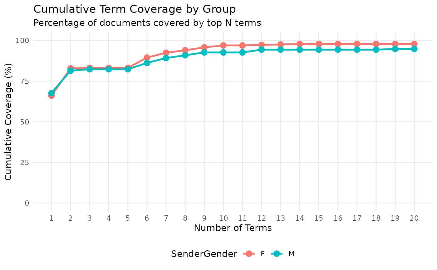
Be careful when cleaning data!
Recommendations for usage 1. Thoroughly clean out stopwords 2. Make an informed decision on whether to remove numbers, special characters, URLs etc.