Identify and Visualise the Textual Differences Between Groups
Source:R/calculate_wlos.R
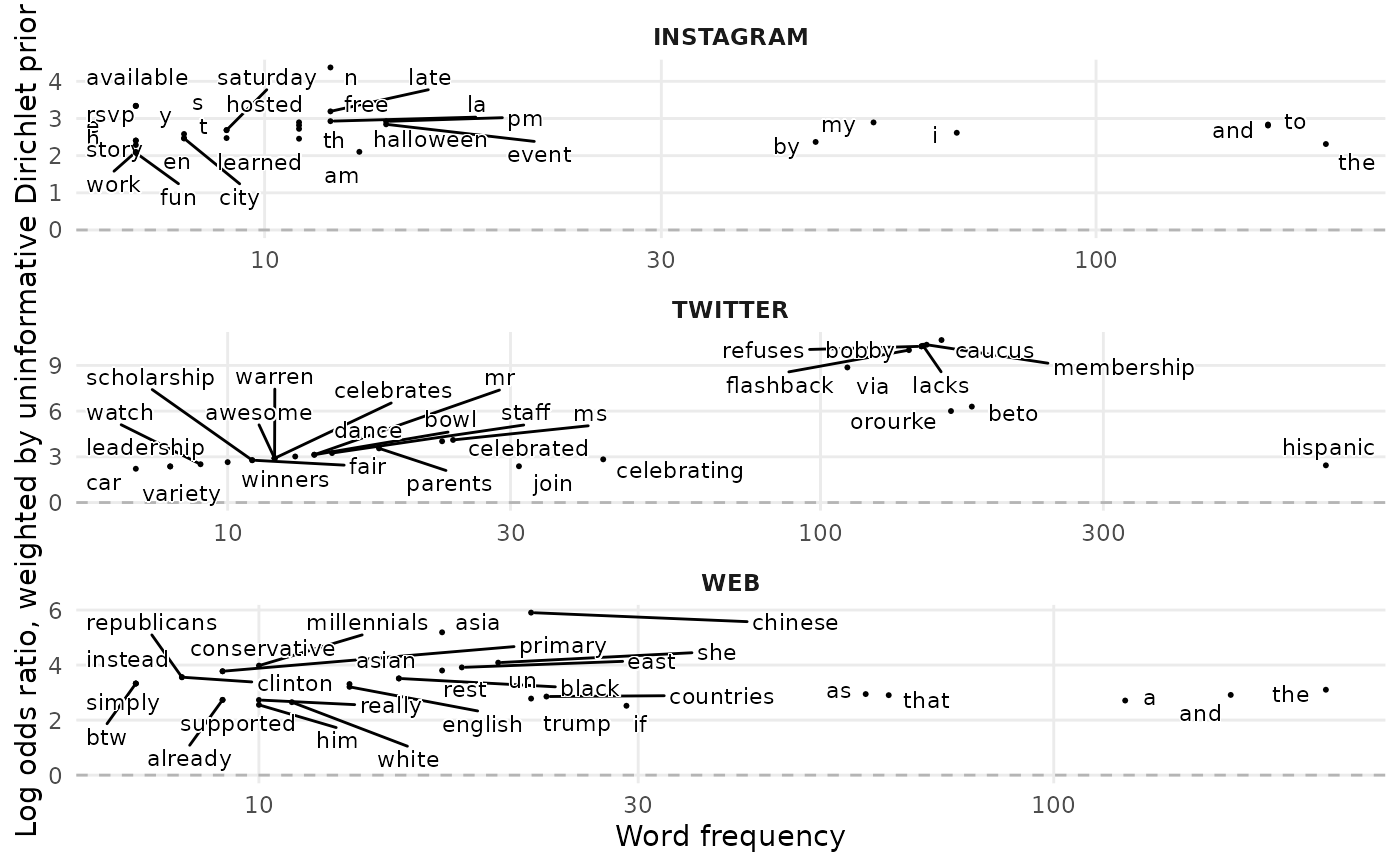
calculate_wlos.RdPlots terms that are more/less likely to appear in conversation across different topics or groups.
Usage
calculate_wlos(
  df,
  topic_var,
  text_var = Message,
  top_n = 30,
  filter_by = c("association", "frequency"),
  top_terms_cutoff = 500,
  nrow = 4
)
Arguments
- df
A data frame.
- topic_var
The variable that contains the topic label for each post.
- text_var
The variable containing the text to be compared.
- top_n
The maximum number of words to include for each topic in the visualisation.
- filter_by
Whether the top_n terms per category are ordered by their association (high WLO value) or by frequency
- top_terms_cutoff
The maximum number of terms to select the WLOs from. Only relevant for filter_by = "association"
- nrow
The number of rows the plots should be displayed with.
Value
A list containing a table with weighted log-odds calculated for each word in each group, and a visualisation
Details
Algorithm: 1. All words are counted in the corpus. 2. All words are counted for each group - set by `topic_var =`. 3. The weighted log-odds are then calculated with all words from the corpus. 4. We then check the parameter of the `filter_by` argument, to decide whether we filter the the words in each group by their frequency within each group, or their weighted log-odds within each group. 4. i. If we `filter_by` association, then we retain all terms that are in the top x of the entire dataset - where x is the parameter of the 'top_terms_cutoff'. We then filter each group for their highest values for weighted log-odds. This blends overall high frequency terms and association. 4. ii. If we `filter_by` frequency then we simply take the `top_n` terms per group by frequency.
There is an important interaction between the 'filter_by' and 'top_terms_cutoff' arguments to take into account.
When using `filter_by` = "association" , the higher the value of `top_terms_cutoff`, the more low-frequency terms you will include; if your dataset is small, this could mean very low frequency terms are being plotted. A good starting point is ~ 500-1000, but make sure you sense check outputs.
If you wanted to see only the top 50 terms of the whole dataset and how they are distributed across groups, you could use top_terms_cutoff == 50 and `filter_by` = "frequency".
Examples
{
sprinklr_export <- sprinklr_export[1:1000,]
sprinklr_export <- clean_text(sprinklr_export, Message)
calculate_wlos(sprinklr_export, SocialNetwork, Message)
}
#> Beginning parallel sessions
#> Ending parallel sessions
#> $viz

#>
#> $view
#> # A tibble: 90 × 4
#>    SocialNetwork word           n log_odds_weighted
#>    <chr>         <chr>      <int>             <dbl>
#>  1 TWITTER       hispanic     704              9.36
#>  2 TWITTER       heritage     524              7.90
#>  3 TWITTER       he           191              5.21
#>  4 TWITTER       beto         179              5.68
#>  5 TWITTER       orourke      165              5.39
#>  6 TWITTER       caucus       157              5.52
#>  7 TWITTER       because      154              3.63
#>  8 TWITTER       our          154              2.69
#>  9 TWITTER       membership   151              5.42
#> 10 TWITTER       lacks        149              5.38
#> # ℹ 80 more rows
#>
#>
#> $view
#> # A tibble: 90 × 4
#> SocialNetwork word n log_odds_weighted
#> <chr> <chr> <int> <dbl>
#> 1 TWITTER hispanic 704 9.36
#> 2 TWITTER heritage 524 7.90
#> 3 TWITTER he 191 5.21
#> 4 TWITTER beto 179 5.68
#> 5 TWITTER orourke 165 5.39
#> 6 TWITTER caucus 157 5.52
#> 7 TWITTER because 154 3.63
#> 8 TWITTER our 154 2.69
#> 9 TWITTER membership 151 5.42
#> 10 TWITTER lacks 149 5.38
#> # ℹ 80 more rows
#>