Visualise the top terms by frequency for a grouping variable
Source:R/viz_group_terms_network.R
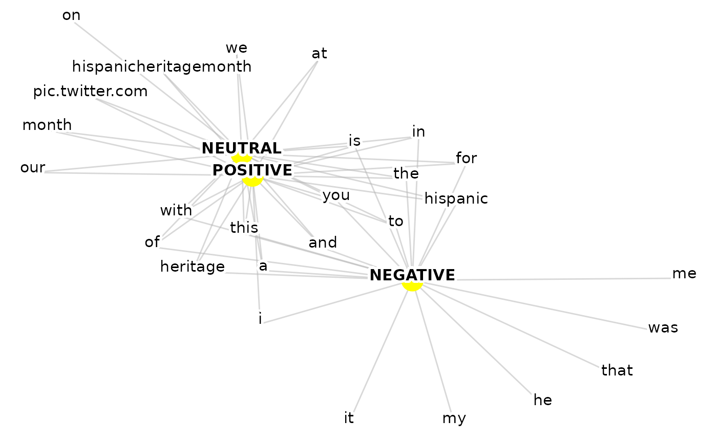
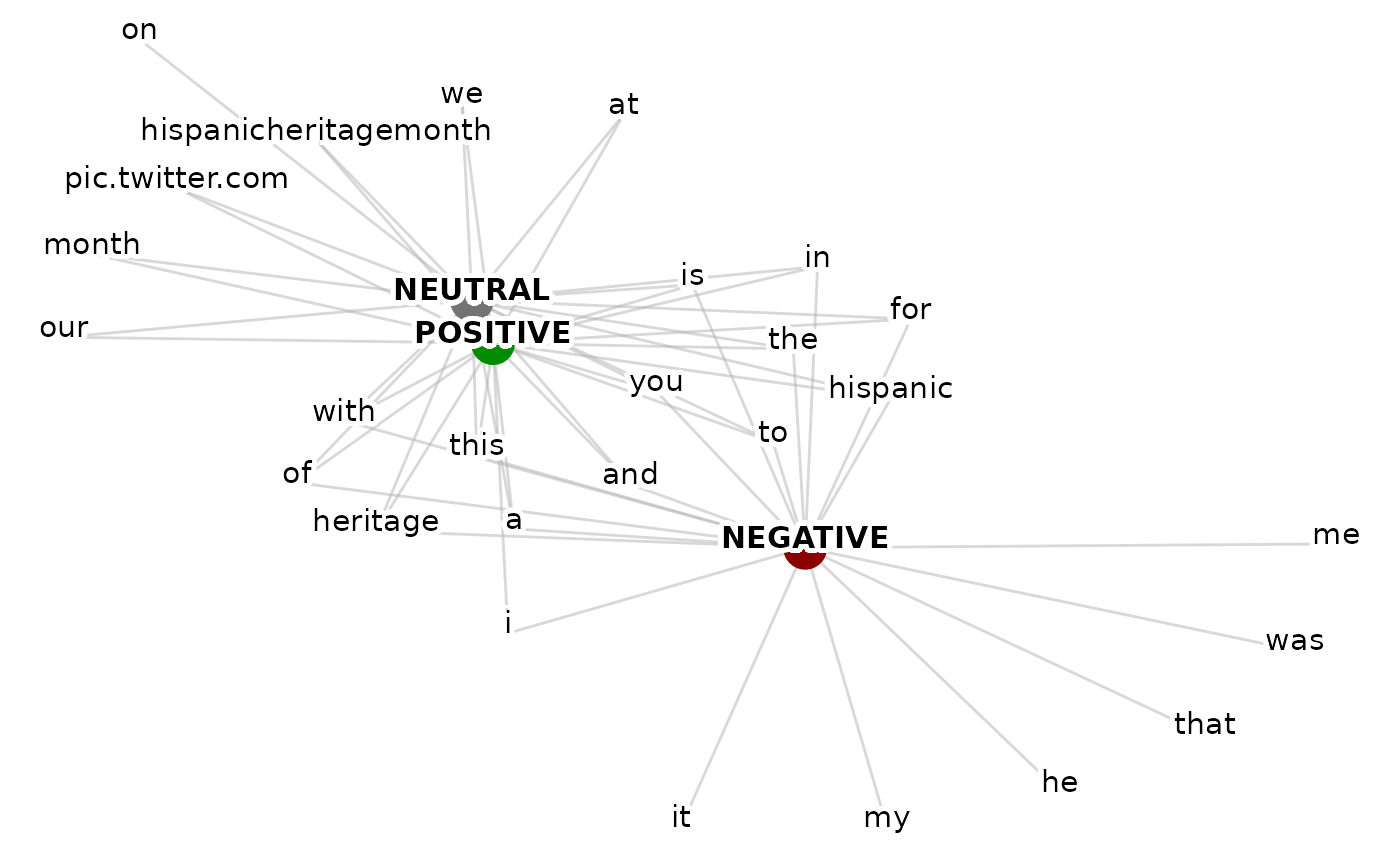
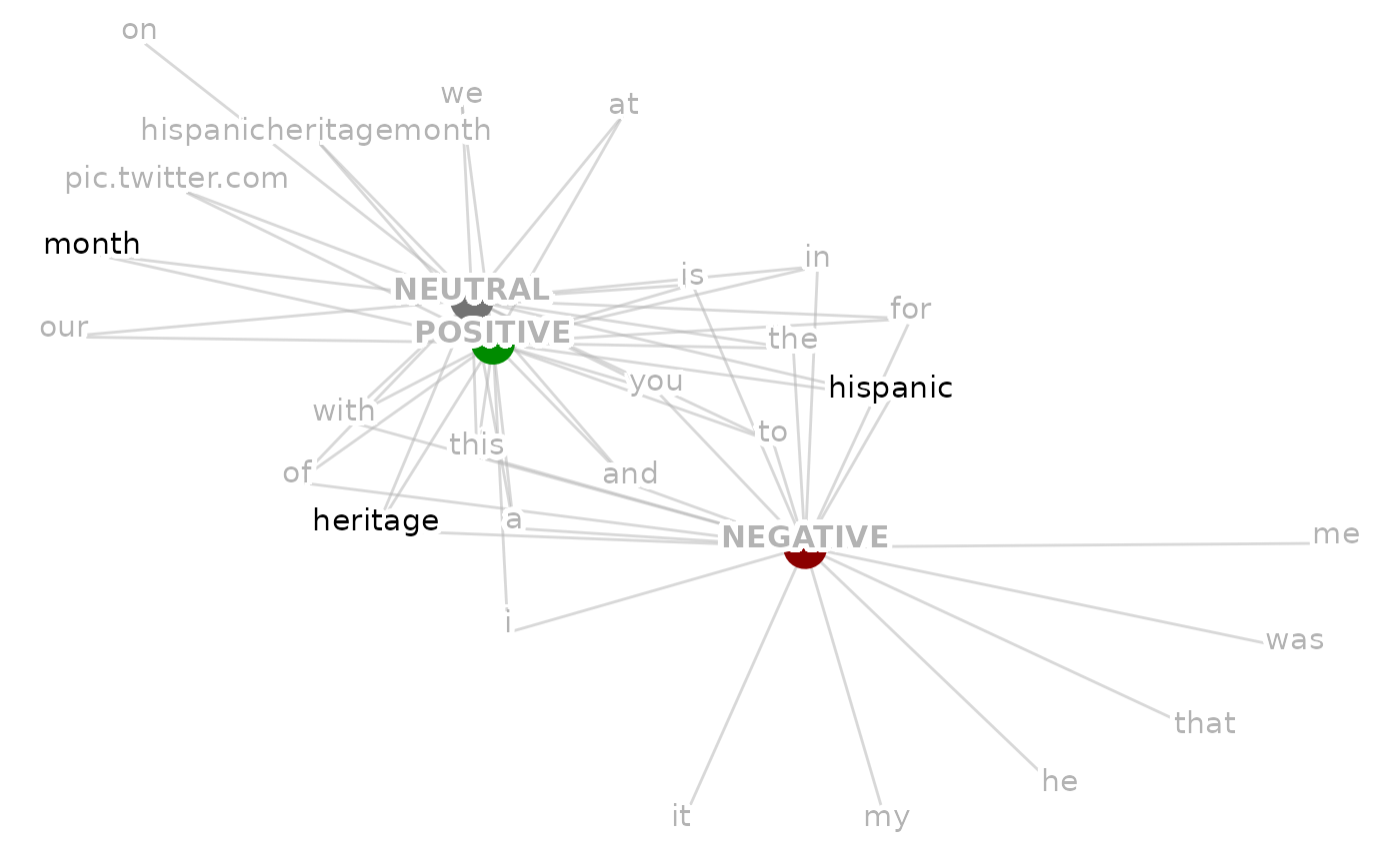
viz_group_terms_network.RdA network visualisation, where the big nodes are levels of group_var e, e.g. topic -> topic_1, topic_2 etc. connected by edges to the small nodes which are the most frequently seen terms for each level of the grouping variable
Usage
viz_group_terms_network(
  data,
  group_var,
  text_var,
  n_terms = 20,
  text_size = 4,
  with_ties = FALSE,
  group_colour_map = NULL,
  terms_colour = "black",
  selected_terms = NULL,
  selected_terms_colour = "pink"
)
Arguments
- data
A data frame or tibble containing both the text_var and group_var columns
- group_var
A group variable or factor. This could be either; brand, audience, sentiment or similar
- text_var
The text variable assigned to each observation containing the message or post
- n_terms
How many of the highest mentioned terms per group should be included in the visualization
- text_size
An integer stating the desired text size
- with_ties
Whether to allow for > n_terms if terms have equal frequency in `group_var`'s count
- group_colour_map
For if the user wants to apply custom colour mapping to the group variables
- terms_colour
What colour should the terms be?
- selected_terms
Any terms that the user wishes to colour differently(should be supplied as a list)
- selected_terms_colour
What colour should any selected terms be? This includes all those defined in the list supplied to the `selected_terms` argument
Value
Returns a ggplot network visualization showing the relationship between terms in a text variable and any group variable in the data, byway of counting the most frequently used terms in conjunction with each class of the group variable.
Details
The main idea of this function is to help identify which groups have similar terms associated with them - big nodes will placed close by to the other big nodes they share terms with, if a big node shares no other terms with another big node they will be placed far apart.
It's important to communicate how many of the top terms have been selected for, as if the term "happy" is #18 for group 1, and #21 for group 2, and our cut off point was 20, we may falsely assume that "happy" is not a term shared by both groups. Looking further down the list (setting n_terms to 30-40) to strengthen any inferences made is recommended.
Examples
set.seed(1)
viz_group_terms_network(data = ParseR::sprinklr_export,
group_var = Sentiment,
text_var = Message,
n_terms = 20,
text_size = 4,
with_ties = FALSE,
group_colour_map = NULL,
terms_colour = "black",
selected_terms = NULL,
selected_terms_colour = "black")
#> Warning: Removed 27 rows containing missing values or values outside the scale range
#> (`geom_point()`).
 # To add group colour
sentiment_colours <- c("NEGATIVE" = "#8b0000",
"NEUTRAL" = "grey45",
"POSITIVE" = "#008b00")
set.seed(1)
viz_group_terms_network(data = ParseR::sprinklr_export,
group_var = Sentiment,
text_var = Message,
n_terms = 20, text_size = 4,
with_ties = FALSE,
group_colour_map = sentiment_colours,
terms_colour = "black",
selected_terms = NULL,
selected_terms_colour = "black")
#> Warning: Removed 27 rows containing missing values or values outside the scale range
#> (`geom_point()`).
# To add group colour
sentiment_colours <- c("NEGATIVE" = "#8b0000",
"NEUTRAL" = "grey45",
"POSITIVE" = "#008b00")
set.seed(1)
viz_group_terms_network(data = ParseR::sprinklr_export,
group_var = Sentiment,
text_var = Message,
n_terms = 20, text_size = 4,
with_ties = FALSE,
group_colour_map = sentiment_colours,
terms_colour = "black",
selected_terms = NULL,
selected_terms_colour = "black")
#> Warning: Removed 27 rows containing missing values or values outside the scale range
#> (`geom_point()`).
 # To supply selected terms and colour them differently
selected_terms <- c("hispanic", "heritage", "month")
set.seed(1)
viz_group_terms_network(data = ParseR::sprinklr_export,
group_var = Sentiment,
text_var = Message,
n_terms = 20,
text_size = 4,
with_ties = FALSE,
group_colour_map = sentiment_colours,
terms_colour = "grey70",
selected_terms = selected_terms,
selected_terms_colour = "black")
#> Warning: Removed 27 rows containing missing values or values outside the scale range
#> (`geom_point()`).
# To supply selected terms and colour them differently
selected_terms <- c("hispanic", "heritage", "month")
set.seed(1)
viz_group_terms_network(data = ParseR::sprinklr_export,
group_var = Sentiment,
text_var = Message,
n_terms = 20,
text_size = 4,
with_ties = FALSE,
group_colour_map = sentiment_colours,
terms_colour = "grey70",
selected_terms = selected_terms,
selected_terms_colour = "black")
#> Warning: Removed 27 rows containing missing values or values outside the scale range
#> (`geom_point()`).
 plot <-viz_group_terms_network(data = ParseR::sprinklr_export,
group_var = Sentiment,
text_var = Message,
n_terms = 20,
text_size = 4,
with_ties = FALSE,
group_colour_map = sentiment_colours,
terms_colour = "grey70",
selected_terms = selected_terms,
selected_terms_colour = "black")
plot <-viz_group_terms_network(data = ParseR::sprinklr_export,
group_var = Sentiment,
text_var = Message,
n_terms = 20,
text_size = 4,
with_ties = FALSE,
group_colour_map = sentiment_colours,
terms_colour = "grey70",
selected_terms = selected_terms,
selected_terms_colour = "black")